OmniNexus Team
Build a One-Page Brand Kit Before You Make Another Ad
A one-page brand kit covers logo, colours, fonts, photo style, tone and ad layouts. Build yours in an hour, then check any ad against it in a minute.
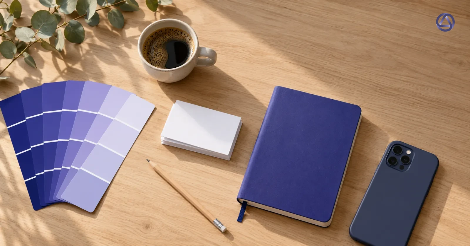
You made an ad on Monday in blue, a post on Wednesday in green, and a friend's cousin did a banner on Friday with a font nobody has seen before. Each one looked fine alone. Together, your feed looks like three different shops.
A brand kit fixes that, and it doesn't need to be a 40-page PDF. One page is enough if every line on it settles a decision you would otherwise make again for every ad. Here is what goes on that page, and how to use it.
Logo files and clear space
Start with the logo, because it is the thing people get wrong most often. Keep three files in one folder: a full-colour version, a single-colour version for busy photos, and a reversed version (light logo for dark backgrounds). Save them as PNG with a transparent background, plus an SVG if you have one.
Then write one rule for clear space: leave an empty clear space margin around the logo at least as tall as a letter in your brand name. Nothing enters that margin, not text, not a sticker, not the edge of the photo. Add one line on minimum size, for example "never smaller than 5% of the ad width", and one line on what you never do: stretch it, add a shadow, put it on a patterned background.
A small colour palette
Pick a main colour, one accent and a few neutrals. That is all. Eleven colours make a paint shop, and nobody remembers a paint shop.
- Main colour: the one people should link to you. It covers backgrounds, headlines or the logo.
- Accent: a single colour for the thing you want the eye to land on, such as a button or a price.
- Neutrals: a dark one for text, a light one for backgrounds, and maybe a mid grey.
Write the hex codes next to each colour. If you can't type the code, you can't reuse the colour. Also add one rule on contrast: text must be easy to read against whatever sits behind it, so dark text on light, or the reverse, and never the accent colour on the main colour.
One or two fonts
Choose one font for headlines and one for body text. A single font in two weights also works. Write down the names, where to get them, and which one is used for what.
Add a fallback too. If a free tool on someone's phone doesn't have your font, which common font do you accept? Deciding that now beats finding a random substitute in a live ad.
Photo style
Photos shape how your ads feel. Describe your style in a few plain lines:
- Light: natural window light, or bright studio light?
- Angle: close up and from above, or eye level?
- Background: clean surfaces, or real places?
- People: faces in shot, or only hands?
- Edit: warm and soft, or cool and sharp?
Then pick three of your own photos that match and put them at the bottom of the page as reference. When someone asks "is this photo right?", they compare it to those three.
Tone of voice
Write your tone in one sentence, then list words you use and words you avoid. Two short lists do more work than a paragraph about being "friendly and professional".
Take a small pilates studio in Bangsar and an accounting firm for small businesses in Business Bay, Dubai. Their tone cards might look like this:
| Card | Pilates studio | Accounting firm |
|---|---|---|
| Tone sentence | "We talk like a patient coach, calm and encouraging, never pushy about bodies." | "We talk like a calm senior colleague, clear and exact, no jargon." |
| Words you use | beginners welcome, small class, book a trial, at your own pace | deadline, filing, plain numbers, we will check it |
| Words you avoid | bikini body, burn, no pain no gain, flawless | synergy, solutions, best-in-class, stress-free |
Add a line on language too. The studio might post in English, Malay and Chinese, and the firm in English and Arabic. Decide which language leads, and where a translation goes.
Two or three reusable ad layouts
A layout is a fixed arrangement: where the photo goes, where the headline goes, where the logo sits, where the button or offer sits. Three layouts are plenty. Draw each as a box sketch on your page and name them.
Layouts for the studio
- Class photo: one big photo of a class in motion, a short headline at the bottom, logo top left.
- Schedule notice: plain background in the main colour, new class days and times in large type, small photo in the corner.
- Meet the instructor: a photo of an instructor setting up the room, one line of story, logo bottom right.
Layouts for the accounting firm
- One question, one answer: the question as the headline ("Is your next filing due?"), a two-line answer, logo at the bottom.
- Checklist card: a short list on a light background with the accent colour on the key item.
- Team face: a portrait of one partner, a name and role, one sentence on what they handle.
Plan your sizes at the same time. Most ads end up in a few shapes, such as 1:1, 4:5 and 9:16, so make sure each layout still works when you crop it.
Check any ad against the kit in a minute
Once the page exists, checking is quick. Hold the ad next to the kit and run down this list, one point at a time:
- Is the logo one of your three files, with the clear space intact?
- Do the colours come from your palette, with the accent used once?
- Are the fonts the ones on the page?
- Does the photo look like your three reference photos?
- Read the copy aloud. Does it sound like your tone sentence, and does it avoid your avoid-list?
- Does it follow one of your layouts?
If you say no to any point, fix it before it goes out, since that one is usually the thing someone will notice. The check takes about a minute because you match the ad to a page you already agreed with yourself, with no taste debate.
This also helps when other people make your ads. A freelancer, a part-timer or an agency gets the one-pager on day one, and you have a fair way to say "this is off" without an argument about opinions.
Where Marvis fits
If you would rather not build the first draft by hand, Marvis has a brand setup step. You answer six short questions or let AI read your social profiles, then add your logo and up to 6 colours. You also pick a tone for your posts, and Marvis writes in any language. After that, you edit and approve each post before it publishes.
Fonts, photo style and your layouts still live on your one-pager, so keep the page handy and use the six-point check on whatever Marvis drafts. You can try it here, and the kit is worth having even if you never do.
Do this today
Open a blank document and make six headings: logo, colours, fonts, photos, voice, layouts. Fill in the easy ones first, then use your last ten ads to fill the rest, because your best ones already show what your brand looks like. Save the page where everyone who touches your ads can find it, and run the six-point check on the next ad before you post it.